

 3
3


Andy Warhol (1928 to 1987) was the leading figure in pop art. He was an American painter, printmaker and filmmaker. He was a successful commercial illustrator before becoming and international celebrity. He was known for his silk-screens of both famous people and everyday objects. Some of his more famous works include the Campbell's Soup (1960), 10 Marilyns, (1967), Brooklyn Bridge (1983) and the Gun (1981-82)

Roy Fox Lichtenstein (1923 – 1997), an American Pop Artist commonly used popular advertising and comic book styles. He viewed Pop Art as, "not 'American' painting but actually industrial painting". Some of his more famous works are the “Drowning Girl” (1963), which is on display at the Museum of Modern Art, New York and the head (1992) in Barcelona.

Billy Apple was a New Zealand sculptor and conceptual artist. He was associated with the New York school of Pop Art in the 1960’s. He collaborated with Andy Warhol and others. He pioneered the use of neon in art works. As a result of his influence to the pop art movement his works are now part of the permanent collection of the Museum of New Zealand Te Papa Tongarewa.

Peter Phillips (1939-Present) was an English artist and one of the originators of pop art in Britain, he moved to New York and then later to Europe where he now lives and continues with his work. His works ranged from oils on canvas, media composition, collages, sculpture and architecture. Some of his more reputable works were: Purple Flag (1960) For Men Only - Starring MM and BB (1961) and the Entertainment Machine (1961).

The Bauhaus was founded in 1919 by German architect Walter Gropius. Its main objective was a fundamental concept: to remake the material world to reflect the unity of all the arts. The school was based upon aestheticism “fervent utopianism”. Its ideals or features are simplified forms, unadorned functionalism, a belief that the new machine economy could deliver elegant design items for the masses applying techniques and materials used in industrial manufacturing and fabrication steel, metal, tubular metal, chrome, concrete, glass, timber, fabric and pottery. The schools primary focus was to create a ideal world craft association combining architecture, sculpture, and painting into a single creative expression. The Bauhaus combined elements of both fine arts and design education and had specialized workshops, which included wall painting, weaving, cabinetmaking, pottery, typography, and metalworking .

4 Designers/ Artists
Joost shcmidt (1893-1948) was a teacher at the school of Bauhaus and later became a professor in Berlin at the college of visual arts. He was a visionary typography/graphic designer. He is best known for his poster for the 1923 Bauhaus exhibition in Germany.
Johannes Itten (1888- 1967) was a Swiss expressionist painter, writer, teacher and theorist who was one of the core member of the school of Bauhaus. He taught the basics of material characteristics, composition and colour. In his book the art of colour he extended the colour wheel; to include 12 colours.

Oskar schlemmer (1888-1943) was a painter, sculptor and designer. He worked in the Bauhaus workshop of sculpture, only to become master of form at his theatre workshop a short time after. His most famous work is "Triadisches Ballett," in which the actors are transformed from the normal to geometrical shapes. He ran the mural painting and sculpture departments at the school of Bauhaus. He was a very complex thinker and influential in forming the philosophy of the school.
Herbert Bayer (1900-1985) was a graphic designer, architect, photographer and painter. He studied for four years at the School of Bauhaus under the direction of the core teachers of the school and later became director of printing and advertising at the school. An adherent of reductive minimalism, he developed and adopted different typefaces and styles and the use of all lowercase font for school publications. He experimented with a simplified more phonetic based alphabet. He also developed a geometric sans serif typeface. In 1939 he settled in New York after a long career in graphic arts. He was heavily involved in architecture in aspen Colorado and produced promotional posters for skiing.
The aim of the Intolerance poster was to create a poster in the genre of International Style. After being told in class that it wasn’t of that style, I searched the internet for posters that bore some resemblance to mine to find out what style my poster fell under. I found two images, which can be seen in my blog entry for post modernism, one being created by Neville Brody a prominent artist in the post-modern movement. The other image that came up in my search, while unattributed, was described as postmodernism. I conducted my searches after I created the Intolerance poster. I am ambivalent about my intolerance poster being Postmodernism. If pressed I would argue that it is because it has many prominent features of Avant Garde Typography and combines them with texture and different fonts and borrows ideals from International style but moves on by using angles other than 90 degrees and diagonal lines “embracing the mixture of ideas, forms and medias”, the hallmark of Postmodernism.

Processes
1

2

3
Finished Poster

Movements within postmodern art include:
4 Designers/Artists
This poster is by Milton glasser. It includes grid, text, both contradicts purity of form and technique by being very busy, using different size fonts, colour, and case. Some of his more well know works is his “ I Heart NY” logo.

This image is by Wolfgang Weingart. It uses aspects of international style but it veers into kinetic decoration by textured overlay on the image and typography.

The image below is by Neville Brody. It uses international style and new typography techniques but diversifies from it by using text and images with different alignments.

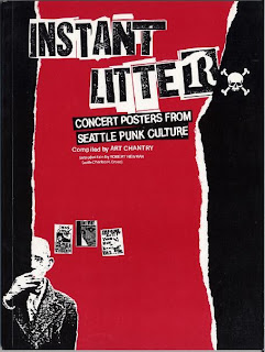
The image below is by art chantry. It makes use of number styles including typography, dada, International Style with grid and text and blends a different Pop Culture.
